A website redeisgn and virtual tour made for the GreenU, the sustainability program from the University of Miami. The website redesing gives a fresh look to the GreenU Green Buildings page and the Virtual tour guides the user to all the green initiatives the new student residence, Centennial Village, has to offer.
The client was the Green U, which is the sustainability program for the University of Miami , who requested a virtual tour for Centennial Village, the new residence builidng at the university. As well, the class included a website redesing of the Green Buildings page on the GreenU website. The project is called GreenU Green Builidngs Page Redesign and Centennial Village Virtual Tour.
The problem was that the original page includes style incosistencies and lackness of clarity. For the virtual tour the problem was that the new building didn't have a virtual tour.
The audience were the investors and sponsors, faculty, staff, students and parents. So an improved and clear version of the website and virtual tour was needed so the audience can understand how GreenU is making the campus a sustainable place.
So this project was done in a group of three in a timeline of around two months. In the research part the role was researching the competition. In the design part the role was working on the virtual tour, which at the end was focused on the mobile version and working on the style guide fot the virtual tours.
Before starting the design, a deep research has to be made. So the role was researching the competition. The competition were websites from the sustainability program at universities. Those pages were Penn Sustainability for the University of Pennsylvania, MIT Office of Sustainsbility for Michigan Institution of Tecnhology, and Harvard Office of Sustainability for the University of Harvard.
The pages for these office showed a consistency throughout the page, the contents, images, and components kept the same style which helped with the flow of the page. Besides, the content had a balanced ratio of visual to text, which helped with the digest and retain of the information.
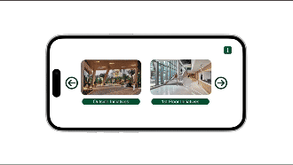
Polished version of the virtual tour
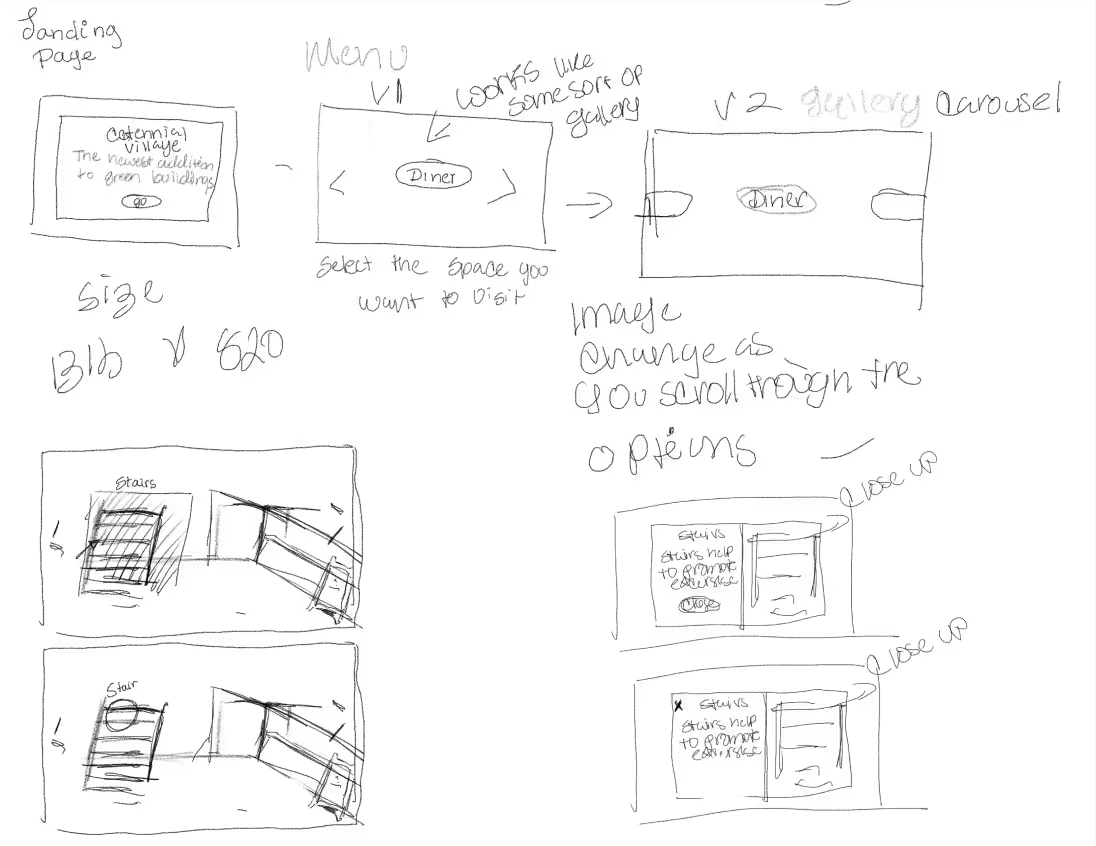
The design process started with sketching the layout for the website redesign. But then took the role to develop the vortual tour. like the website redesign, the design process started with sketches that explained how the tour would work.
Scrapped version showing the floor navigation.
The design process started, the first version tried to incorporate a full view of the floor while the user clicked on the higlighted key items to read about the initiatives, but there were struggles due to the inconsistency it would create with the third floor due to lack of footage of that floor.
Scrapped version of the first tour.
There weren't enough photos for each of the initiatives that would be in each floor and the time constraint was short to develop this complex and big virtual tour, so after discussing it with the team this version was scrapped.
So a second version was developed which displayed the initiatives in a simple manner that could keep consistency thorought the floors. And keeping the sense of exploring by adding a map where the user can have an overview of the building and click throughout the initatives.
So the role changed to focusing on the mobile version of the tour. The goal for this adaptation was making a virtual tour that would be comfortable for the mobile user but keeping the desktop essence. For example, the foor selection screen, instead of having one screen with all the floors it was splitted into two screens with two floors each one as well navigation arrows so the user can navigate through the screens.
Final version of the enviroment in editor view.
The map had to be changed. so it was divided in two phases. The first phase was a full view of the map with green dots that when clicked, it zoomed in to a section with all the buttons tht when tapped the user have infrmation of the initiatives in the section, an the user can go back to the full view to choose another section and see the rest of the initiaitives.
The design process finished with an UI kit that contained the components used in both virtual tours that can be used for reference for designing other virtual tours. And the porject concluded with the presentation to the client where the final versions of the website redesign and virtual tours were shown.
Website redesing wireframe and prototype (Figma)
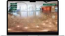
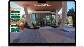
Desktop virtual tour and prototype
Mobile virtual tour and prototype
Website and virtual tour style guides
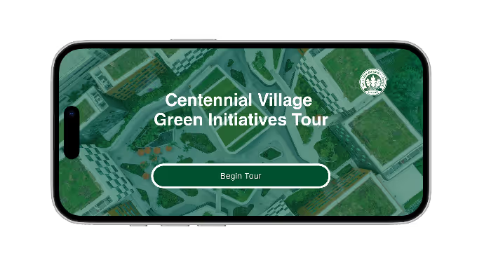
Mobile virtual tour start screen.
At the end, the final product was a clean and user-friendly website redesign and vitual tour. These designs were able to transmit the information of the university approaches, specially the buildings, for sustainability. As well the virtual tour offers the user an intutitive and friendly experience that gave the user a glimpse of the newest addition to the University of Miami while at the same time promoting a sustainable campus lifestyle.
Learned how to design for a real-life client and selling that design to them.
Learned how to communicate with a team and know one's limitations, comunicating them to the rest of the team.
Learned about the importance of visual design and keeping cosistency in each page of the design, specially when prototyping in Figma.
Future Iterations are: Improve the virtual tour experience to fix any glitches. Making the virtual tour more accesible to users. Gamifying the design, like including a quiz or a badge system for every floor completed, to make virtual tour more engaging. Make the virtual tour accessible to everyone.
The images and information used were provided by the University of Miami.