Answer Campus is a game developed by the University of Miami School of Communications’ NerdLab, is a game where the player faces challenging situations as they live the college experience.
In the Answer Campus game the players can use their phone to talk with the characters, track the timeline, and travel through the campus. The task designated was bringing that app to life.
To be able to design this prototype. It was necessary to look for inspirations to have an idea of how the design would look and work. The inspirations were Persona chat interface and a little of Mystic Messenger, games which chatting is a part of or is the gameplay. For the map the initial inspiration was a map in an event for Identity V, which is an asymmetrical game, based on a school and there was a map with the locations the player could visit.
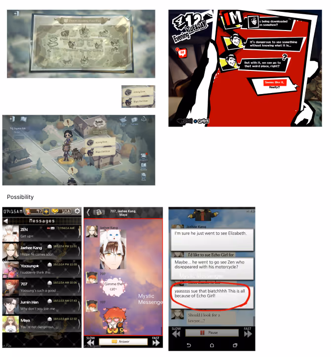
Screenshots of the references.
Figma was used to design the screens, at the beginning the screens were to represent the map, friends, and schedule screens. They were low-fidelity and were meant to have a visual of how the screens would look.
Low-fi wireframes.
Chat first wireframe.
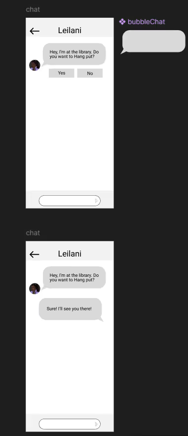
Feedback was received for this version of the chat, and it was redesigned so the player's choices were inside a chat bubble, as shown in one of the references.
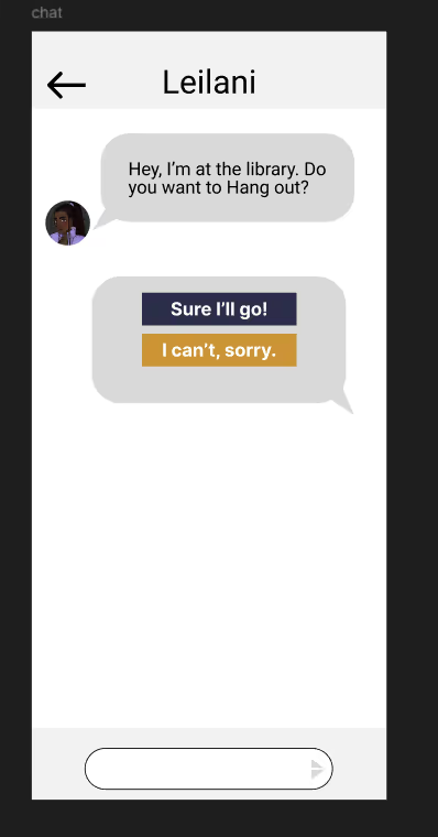
Second version for the chat.
After receiving the necessary feedback, the polishing of the screens started, bringing life and color to the designs.
For the color Palette, the game’s main colors: Blue, yellow, and white were used. For the UI, assets from Answer Camp's UI masterfile were used but altered to fit the content it might contain. For the icons, images from the Figma plugin Iconify were used.
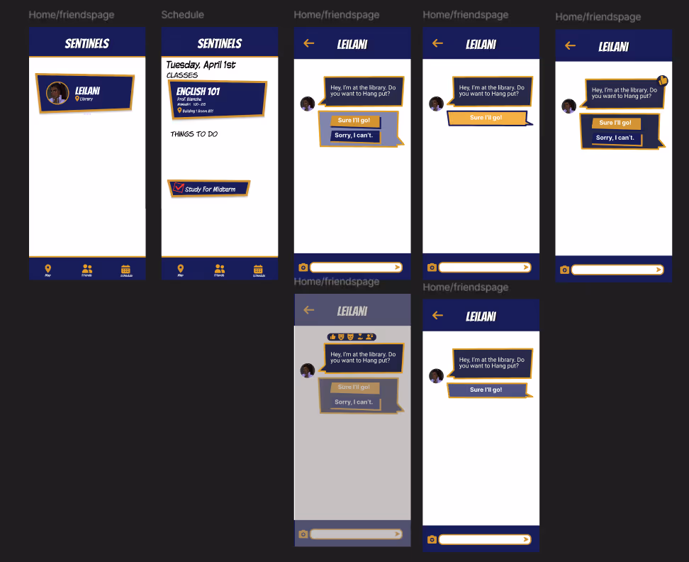
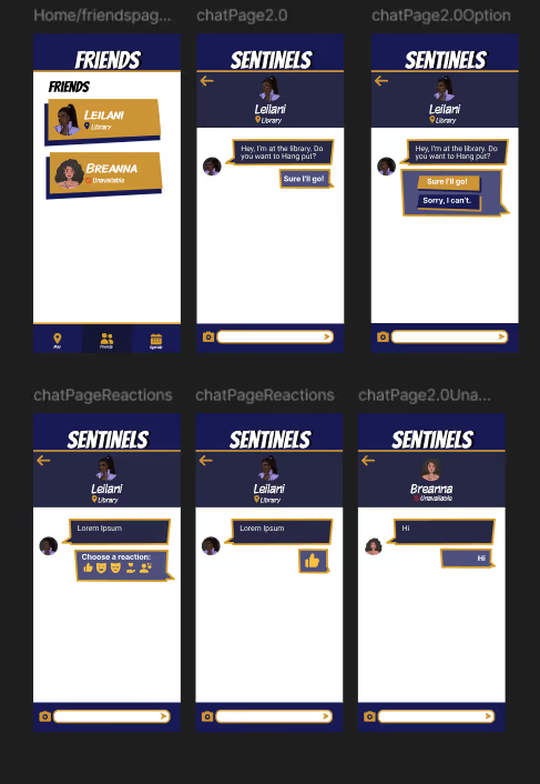
The first version for the friends card, the player choice button from the UI masterfile was used. The content included the character’s name, photo, and location. The photo contained a yellow outline around the image, so it can stand out a little. The chat kept the style of the improved chat and used the chat bubble asset from the UI masterfile, and for the player choices the menu buttons were used. The schedule page, a list of the classes and events were added using the same container as the one for the friends.
First version of the polished wireframe
When the screens were shown to the team behind the game. There improvements to be made like the schedule page, the chat page, the color of the character’s vs the player’s chat bubble, etc. So a second iteration of that polished screen was designed based on the feedback provided.
The friend cards were redesigned, and the container was changed, the content were kept the same but the character's image isn’t a screenshot but the high-res character sprite cropped at the bust without the yellow outline. As well, added an extra friend that wouldn’t display location and have an unavailable state.
Second version of the polished wireframes with icons.
Another version without an icon for the location/state was included, and would be the desired style that would be taken over to the character’s chat.
The chat page was similar to the one of the first iteration, but with the header that displayed the character's information which included the location/ state. There was a version with icons and a version without it.
The calendar was named Agenda and the class list was removed, due to the lack of classes and it was redesigned so it only shows the event happening in the current and next week.
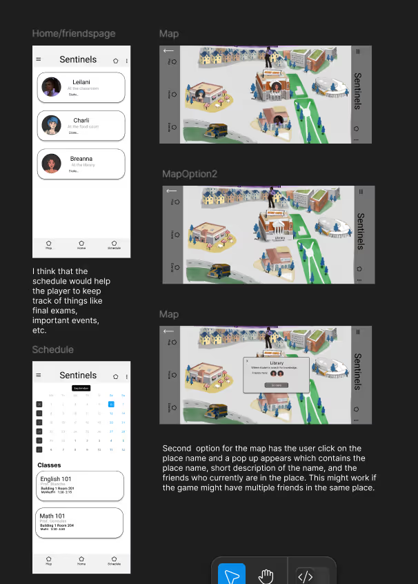
For the map page, it came to the option of instead displaying the map from the campus in a horizontal way. It would be a list of locations of the campus and the friends found there, and if there aren’t any, it just shows a text saying “no friends here”.
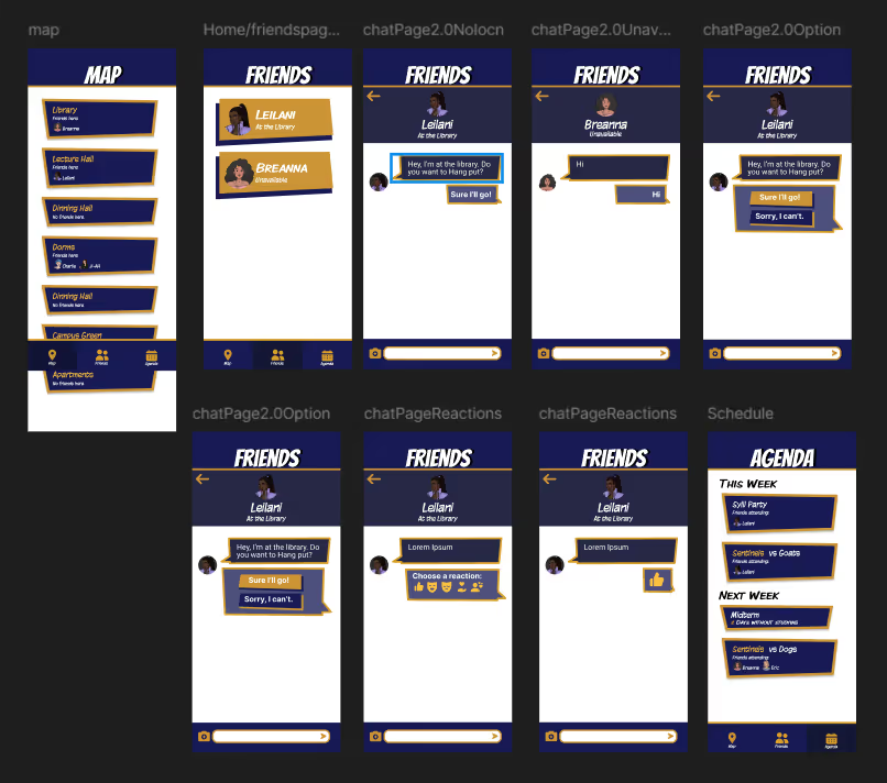
Second version of the polished wireframes without icons, and with locations page.
This design was inappropiate for the game because the content was small for the player to see in the screen. So it had to be reworked to ensure a smooth experience when using the interface.
The new interface was made using Adobe Illustrator.
the texts under the buttons were removed because they were intuitve enough to know what screens each buttons take to and to make the icons bigger for better visibility.
The locations wre changed to a swipe card with the image of the location as background for player to identify each place.
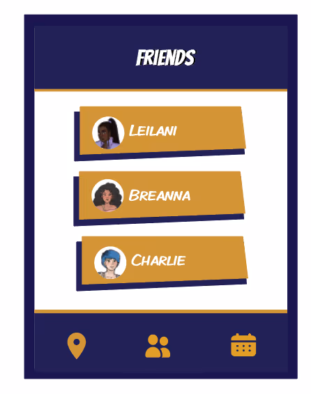
FInal version of the frieds screen.
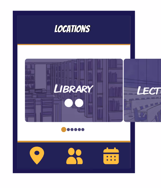
Final version of the locations screen that is swipe rather than scroll.
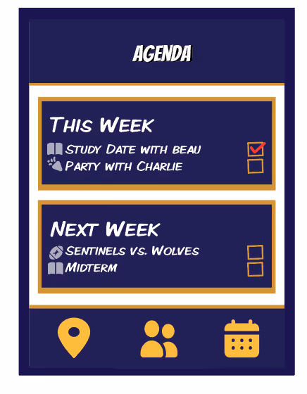
The final version of the agenda screen.
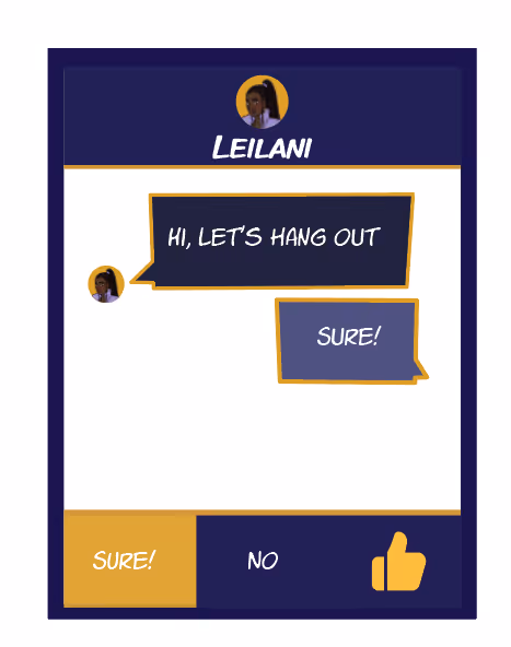
The final version of the chat screen with the player options.
When the design of the screens were done, the assets were imported as png for the implementation in the game and a documentation specifying how each asset have to be arranged was made for smooth implementation in Unity.
It was fun working on an interface for an in-game application and taking inspirations from other games to come up with the design and funtioanlity. As well, being willing to rework fully a design so it can be playable in the game.